Web resources roundup October 2014
This month we have a range of interesting resources we have found around the web for you to check out. Take your time exploring the world's weather, a global conflict, a warming world, money sent home, and smell the rains down in Africa!
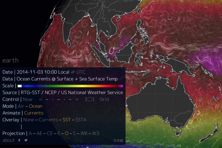
- Earth by Nullschool is a fantastic animated 3D globe that allows you to overlay some beautiful layers of data including wind, ocean currents, surface temperature, pressure and much more. You can find out more information about the data available here. This website is really useful for examining weather at a global, national or regional scale. There is also a similar tool, with a different look which you can find here.
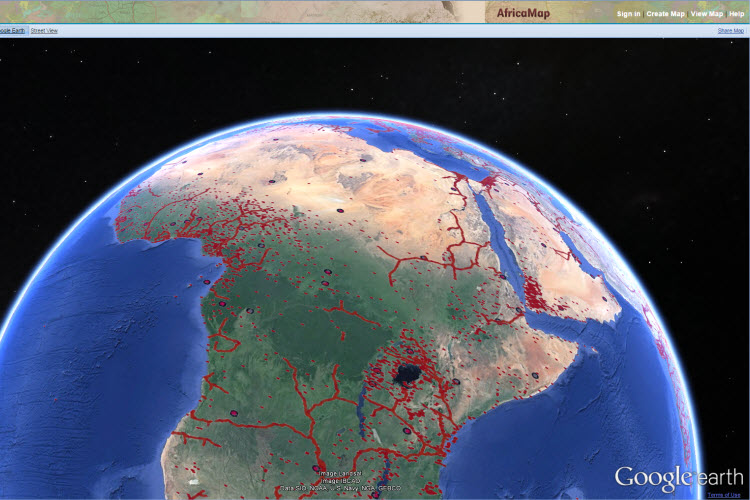
- It is always hard to find good data on other parts of the world but Harvard has created something useful for Africa. AfricaMap provides you with many layers of data that can be overlayed on a 2D map or 3D Google Earth globe of Africa, a place where good data is very hard to find. Everything from disease to language groups and even some historical maps can be displayed on the map for analysis.
- In Syria a complex and brutal war continues to rage on. The ABC have created yet another excellent before and after interactive, this one focussing on the Battle for Kobane. Before and after images can be found here.
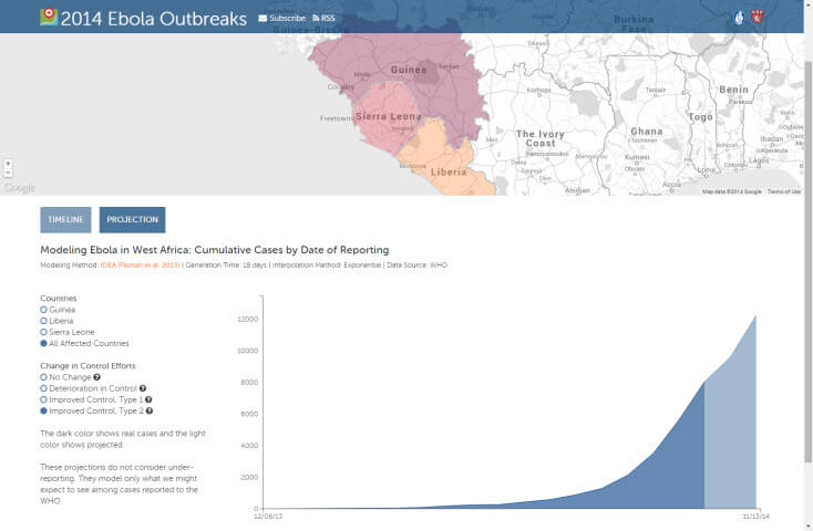
- There are heaps of resources that teachers could use to help teach about Ebola. Have a look at our recent blog post that organises some of these resources in one convenient place.
- New Scientist Climate Change interactive map examines how much the temperature at any given point on earth has changed in the past century. Select a location and you are provided with specific information on how the temperature on that part of the globe has changed over time. Great for anything related to climate change or even weather and climate.
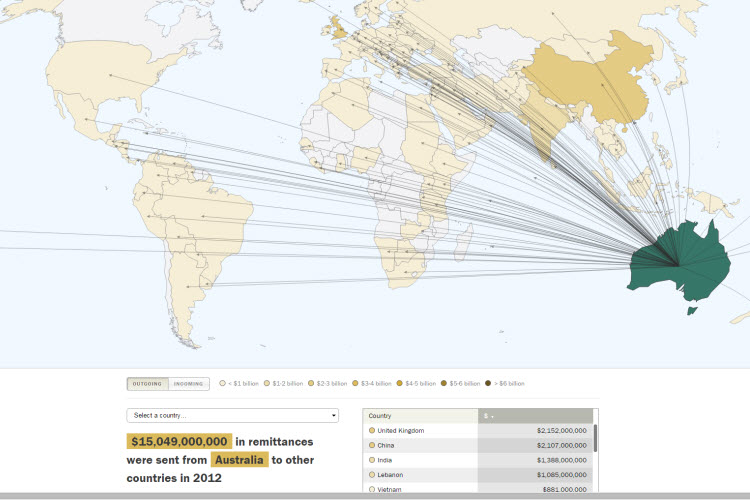
- Remittance involves the movement of money from one person to another in another country. Remittance flows can give us clues about migration and dependence as migrants send money back to their families in the 'home' country. The Pew Research Centre have put together this interactive map that shows where remittance money is coming from and going to across the world.
Ebola Mapping
Not the nicest of topics but one that is getting much media attention these days, Ebola has come out of nowhere and is spreading - fast. There are plenty of online resources that teachers can access to help their students understand the geography of disease, particularly Ebola. I'll bet you didn't know we have geospatial tools to thank for the early discovery of Ebola in West Africa this time around?
Geospatial tools can be used to respond to these sorts of disease outbreaks in a number of ways. The Geospatial Revolution video below outlines how these tools were used to manage a 2009 influenza pandemic admist the Hajj, the annual Islamic pilgrimage to Mecca.
SciDevNet and GIS Lounge both outline how GIS is used to help with the response to West Africa's Ebola outbreak. Primarily this is through mapping the location and spread of the disease to make predictions about where it may migrate, when and at what rate infection can be expected. Mapping comparisons of infection rates v death rates provides a measure of how effective treatment has been in different areas. Many agencies need geospatial tools to help physically get to the areas that are affected.
OpenStreetMap have taken up the challenge to produce an open-source response to the outbreak. The OSM Tasking Manager allocates different parts of the imapct area that need to be mapped, these open source maps can then be accessed by any agency or person on the planet at no cost for use in any way. Many of these areas are not profitible enough to be properly serviced with high quality data but this program crowd sources this data from people on the ground who know the area or people viewing high resolution (much higher than Google Earth) imagery of the area and interpreting that. The International Red Cross has called for more detailed maps that allow aid workers to navigate in areas that are typically unmapped. Interestingly the GIS Lounge article cites the rediscovery of old places.
"In some cases entire towns in western Africa are being rediscovered through these mapping programs. For example, the origin of the Ebola virus is believed to be the town of Guéckédou in Guinea. Older maps of the area showed only nine roads but mappers were able to add hundreds of new roads and streams from satellite images."
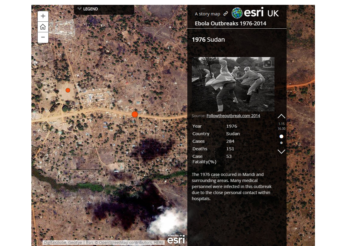
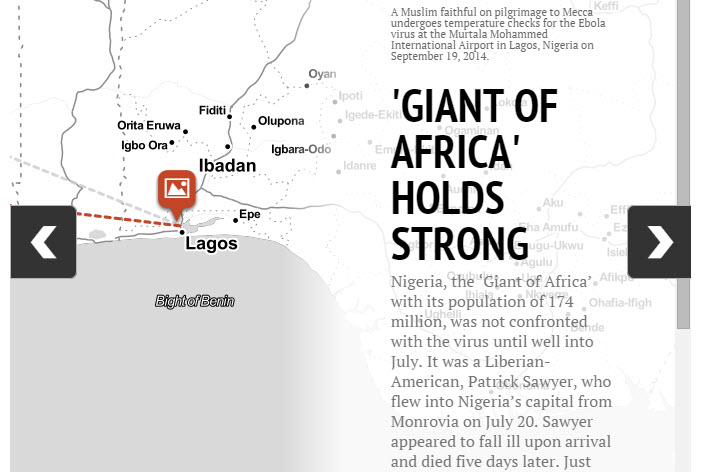
Finally, geospatial tools are inherintly visual tools which make them great tools to use when telling a geographical story. Many news agencies have used geospatial tools to summarise issues around this Ebola outbreak while presenting the information in an interesting way. The Guardian have created an interactive map that tracks Ebola outbreaks from the 1970s to today. RT news have also created an interactive map however focussing on the current outbreak only. The Economist have an infographic, based on a map, that has some additional statistics that may be of use.
Creating a map in Google Drive
Did you know you can easily create a map using your Google Drive spreadsheets tool?
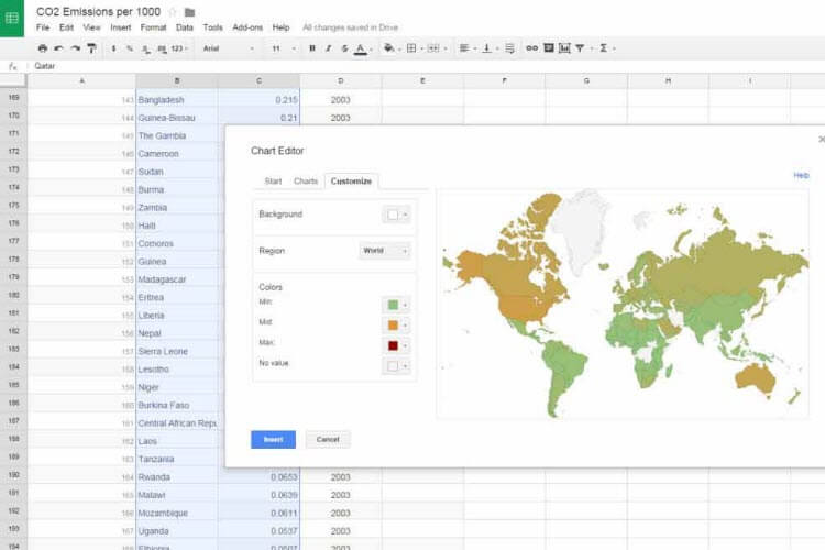
Simply create a Google Spreadsheet that contains some sort of geographic information, this image uses global CO2 emissions per 1000 people for the world's countries. In the Google Spreadsheet, highlight the cells you wish to use in your map. From the Insert menu select Chart, and from the Chart option, select Map. Then choose your map type and you can change the colours on the screen. I've made the background light blue and those countries with no value as a shade of grey. Be aware that Google does not let you choose the categories nor the number of categories. And there is no legend which is a bummer, but as a way to quickly convert data from tabular format to map format it is good!
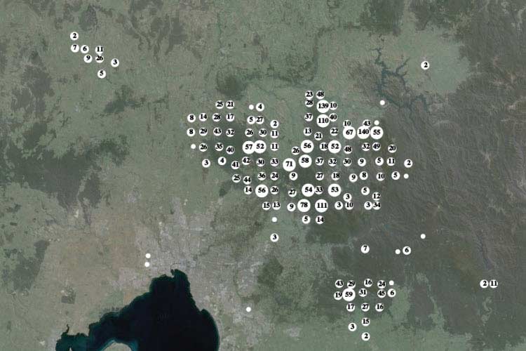
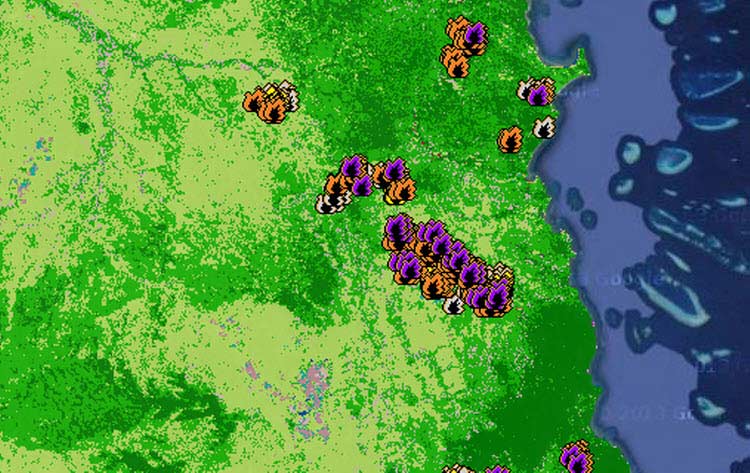
The Sentinel Hotspot Mapper from Geoscience Australia has recently undergone a facelift which makes it much more user friendly. The site was covered in our recent Web Roundup but I wanted to show off all of the new features in a dedicated blog post.
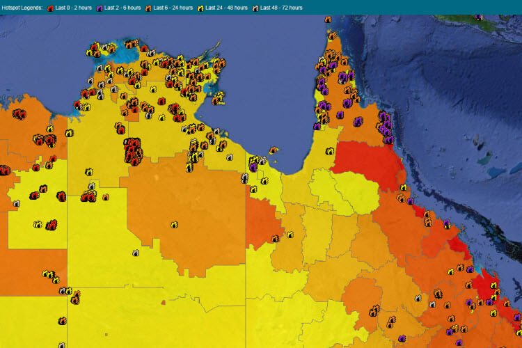
The site itself includes hotspot data from three satellites covering 24 hours of every day. This also includes a repository of hotspot data that goes back to early 2000s and this data can be mapped. The site uses a Google hybrid map (a satellite image with labels) to display the hotspot data and any other data layers selected. Users can select from population data as well as being able to view the value of residential, commercial and industrial land as layers on the map.
There are a range of basemaps including hours old satellite imagery, landcover, topography as well as the data that can be layered on the map. This makes for a versatile tool that can be very useful in the classroom to support students as they learn about bushfires, where they occur, the human risks from bushfires and their potential impacts on our environment and society through the additional data layers provided in the tool.
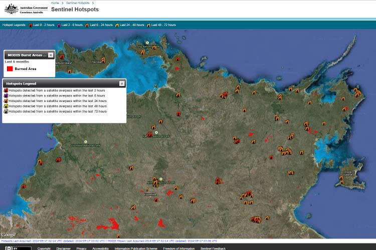
There are of course criticisms, although not many. The only one worth mentioning is that the Sentinel tool no longer supports Bureau of Meteorology layers of data which were useful, especially the live data which was great to examine during a bushfire event or during bushfire season. Teachers could pull up a bushfire-affected region and turn on layers that showed heaps of BoM data from temperature, wind, rainfall, pressure and more. This would be available on the map above each weather station in the region so students could see how the weather changed across the area they were viewing. A sad loss but hopefully only a temporary one.
This tool could be useful Year 5 as there are opportunities to study bushfires there but is probably best used here when directed by the teacher through the data projector. Students right through secondary school will be more than capable of using Sentinel as the tools are fresh and replicate many other websites.
Here is a link to a classroom resource I used to recommend to teachers, however the tools have changed and may not always match the instructions. I will leave it here as inspiration while I update!
Globes
QLD Globe
http://www.dnrm.qld.gov.au/mapping-data/queensland-globe
The Queensland Globe is a fantastic tool that I think will give many teachers a ‘foot in the door’ when it comes to using geospatial technology in their classrooms. This initiative kicked off in 2013 and was led by Queensland’s Department of Natural Resources and Mines and has led the way as other states come on board with similar projects.
There are a number of reasons why I think this tool will succeed in Queensland schools. The Queensland Globe provides a huge range of government data and it uses Google Earth to deliver that data. This allows teachers to use the tool in a range of classroom contexts and topics ensuring its widespread application. Using Google Earth means that most teachers will have some level of exposure to the platform which means it is more likely to be explored in depth, this familiarity with the software is important as it removes the fear of dealing with unknowns and also reduces the time required for teacher and student uptake. It also makes developing and sharing resources easy for teachers as Google Earth is a free application.
The data is extensive. The ‘core’ Queensland Globe contains basic data on places, infrastructure, contours, waterways and catchments and high quality imagery from across Queensland, in some rural and remote cases this imagery is of higher quality and more recent than Google’s. The user can access more specific globes that contain data on mines, coal seam gas and flood data from as far back as 2011. The flood globe contains imagery from each major Queensland flood peak and a layer representing the flood extent. This looks great when match up with contour lines and viewed at an angle to make the most of the 3D effect provided by Google Earth.
Here are just some of the data sets that can be accessed using Queensland Globe: places, boundaries, road, rail, transport, infrastructure, vegetation, contours, mines and mine locations, geology, land valuations and flood data.
To view the data, ensure you have the latest version of Google Earth and then simply download this .kml file. To view the data in future, simply double click on the qldglobe.kml file, no need to download again.
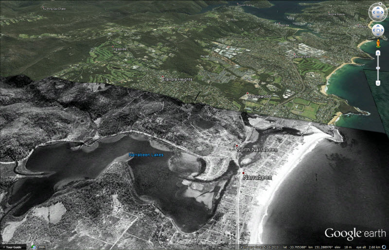
NSW Globe
http://globe.six.nsw.gov.au/
The New South Wales Globe is a similar tool to the Queensland Globe and can be easily accessed in much the same way, follow this link to download the nswglobe.kml.
The platform is identical in Google Earth, in fact you could open both globes together and lay them on top of each other if you wanted to. The data is very similar, obviously covering only NSW in extent. You can also access some historical imagery from Sydney including imagery from 1943.
Both of these tools are a good sign that Australia is beginning to embrace the open data initiatives that have already provided North American and European citizens with good access to their government data. Now it is up to teachers to get out there and support them!